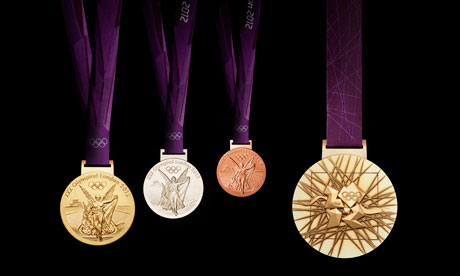
The ancient Greeks, whose Olympiads can be traced back to 776 B.C., did not give out medals but rather awarded olive wreaths upon their victors. The medal tradition began with the first modern Olympic Games in 1896, where winners got silver, seconds got bronze and third place got nothing. In the intervening 112 years, the awards have been rectangular, ridged, doughnut-like, gilded and uniquely shaped.
The Olympic medals’ circular form is a metaphor for the world. The front of the medals for the Summer Games always depicts the same imagery – the Greek Goddess of Victory, Nike, stepping out of the depiction of the Parthenon to arrive in the Host City.
The design for the reverse side for the London Olympics features five symbolic elements:
– The curved background implies a bowl similar to the design of an amphitheatre.
– The core emblem is an architectural expression, a metaphor for the modern city, and is deliberately jewel-like.
– The grid suggests both a pulling together and a sense of outreach – an image of radiating energy that represents the athletes’ efforts.
– The River Thames in the background is a symbol for London and also suggests a fluttering baroque ribbon, adding a sense of celebration.
– The square is the final balancing motif of the design, opposing the overall circularity of the design, emphasizing its focus on the centre and reinforcing the sense of ‘place’ as in a map inset.
For further reading:


0 Comments